(And How to Fix It)
By Sonia Elliott of Elliott SEO
You spent months on your website.
The colours are on-brand, the fonts are clean, and your developer did a great job.
So why isn’t it converting?
Here’s the uncomfortable truth: a beautiful website and a high-converting website are not the same thing.
Most businesses confuse the two — and it costs them leads, sales, and growth every single day.
Whether you’re a startup or an established brand in New Zealand, this post breaks down exactly what separates a website that sits there looking pretty from one that actively works as your best salesperson.
Your Homepage Has One Job — And It’s Not What You Think
Most business owners treat their homepage like a digital brochure.
They want it to tell their whole story, showcase every service, and make a strong brand impression.
That’s not what your homepage is for.
Your homepage has one job: communicate what you do, and get people to take action.
Here is an example from EatLocal.nz
Clarity Always Beats Cleverness
One of the most common mistakes businesses make is trying to sound smart.
They use clever taglines, abstract headlines, and industry jargon — all in an effort to sound sophisticated.
The result? Confusion. And confused visitors don’t convert.
When someone lands on your site, they should be able to answer three questions within five seconds:
- What do you do?
- Who is it for?
- Why does it matter to me?
If your homepage doesn’t answer all three instantly, you’re losing people. Ditch the clever and choose clear — every time.
Above the Fold Is Everything
“Above the fold” refers to everything a visitor sees before they scroll.
It’s your first impression, and in the digital world, first impressions are measured in seconds.
Your above-the-fold section must include:
- A clear, benefit-driven headline — not your company name, not a vague slogan
- A concise statement of the problem you solve
- A compelling call to action — one button, one direction
If this section doesn’t immediately communicate value, visitors leave.
They won’t scroll down to give you a second chance. They’ll simply hit the back button and visit your competitor.
Reduce Friction at Every Step
More options don’t help users — they paralyse them.
More text doesn’t inform users — it overwhelms them.
The principle here is simple: reduce friction.
Every additional choice you give a visitor is an opportunity for them to do nothing.
Every wall of text is a reason to bounce. High-converting websites do the opposite — they strip everything back to:
- One clear path through the page
- One main action you want the visitor to take
Think of your website like a well-lit corridor leading to a single door. Your job is to make that walk as easy and frictionless as possible.
Show Proof Early — People Don’t Trust You Yet
Here’s something most businesses forget: your visitors don’t know you.
They’ve never met you, they’ve never worked with you, and they have no reason to trust you yet.
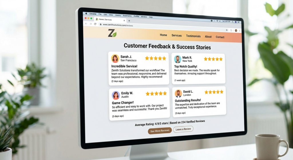
That’s why social proof isn’t optional — it’s essential.
Include trust signals as early as possible on your page:
- Customer reviews and star ratings
- Testimonials with real names and photos
- Case studies and results
- Logos of clients or media you’ve worked with
The moment a visitor sees that real people have trusted you and had great results, their guard comes down.
Trust builds quickly when the evidence is right there in front of them.
Guide the User Journey
A high-converting website isn’t a library. It’s a guided tour.
Think of every section of your site as a step in a conversation. You’re anticipating your visitor’s questions, addressing their doubts, and leading them naturally toward taking action.
Ask yourself:
- What is the visitor thinking when they land on this page?
- What objection might stop them from moving forward?
- What do they need to see next to feel confident?
Great websites are designed around this journey.
They don’t just present information — they create a conversion flow that moves people from “I’m curious” to “I’m ready.”
Design Should Support Clarity — Not Override It
Here’s where a lot of brands go wrong: they prioritise design over message.
Don’t get us wrong — design matters.
But its role is to support clarity, not compete with it. Flashy animations, complex layouts, and heavy visual elements might win design awards, but they rarely win customers.
Good design does three things:
- Makes your message easier to understand
- Draws attention to the most important actions
- Creates a frictionless experience for the user
If your design is getting in the way of your message, it’s working against you.
The Real Reason Most Websites Fail
After everything we’ve covered, it comes down to this:
Most websites fail because they make the user think too much.
Every moment of confusion is a lost conversion.
Every extra click is a reason to leave. Every piece of unnecessary content is friction you didn’t need to add.
Winning websites do the opposite.
They make everything obvious and easy — because when taking the next step requires zero effort, people take it.
So What Should You Do Next?
Start by auditing your homepage with fresh eyes. Ask yourself honestly: can someone who has never heard of your business understand what you do within five seconds? Is there a single, clear action you’re guiding them toward?
If the answer to either of those questions is “not really,” it’s time for a rethink.
For businesses serious about getting this right, working with specialists makes a huge difference.
The team at Elliott SEO Agency Auckland helps Auckland businesses get found where it matters most — whether that’s ranking on the first page of Google or showing up in AI-powered search results.
Once your homepage is dialled in and working hard for you, the next step is making sure the right people are actually finding it.
That’s where Good Oil Marketing comes in — they help businesses turn their newly optimised website into a consistent lead generation machine, bringing in qualified prospects who are ready to buy.
Final Thoughts
Your website is your hardest-working team member — or at least, it should be.
It’s live 24/7, it reaches people you’d never otherwise meet, and it can either make or break someone’s decision to work with you.
But a website that looks good isn’t enough.
A website that works is built on clarity, trust, and a deliberate user journey. Get those three things right, and the conversions will follow.
Stop making your visitors think. Start making it obvious. That’s where the magic happens.